tais.
← All projects

Publication design · Editorial layout

Ko Awatea.

A publication bringing together Ko Awatea’s story, people and work in health system innovation and improvement. Teal and gold, bold typography and recurring geometric motifs connect photography, personal profiles and information across the pages.

My role: publication design and editorial layout. Cover and open-book images are presentation mockups.
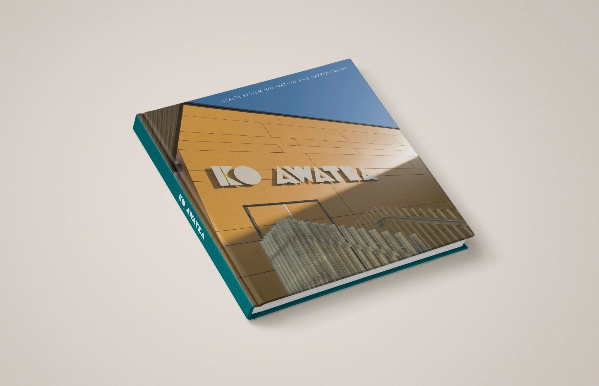
Ko Awatea publication cover featuring the building facade and teal spine
Cover presentation mockup
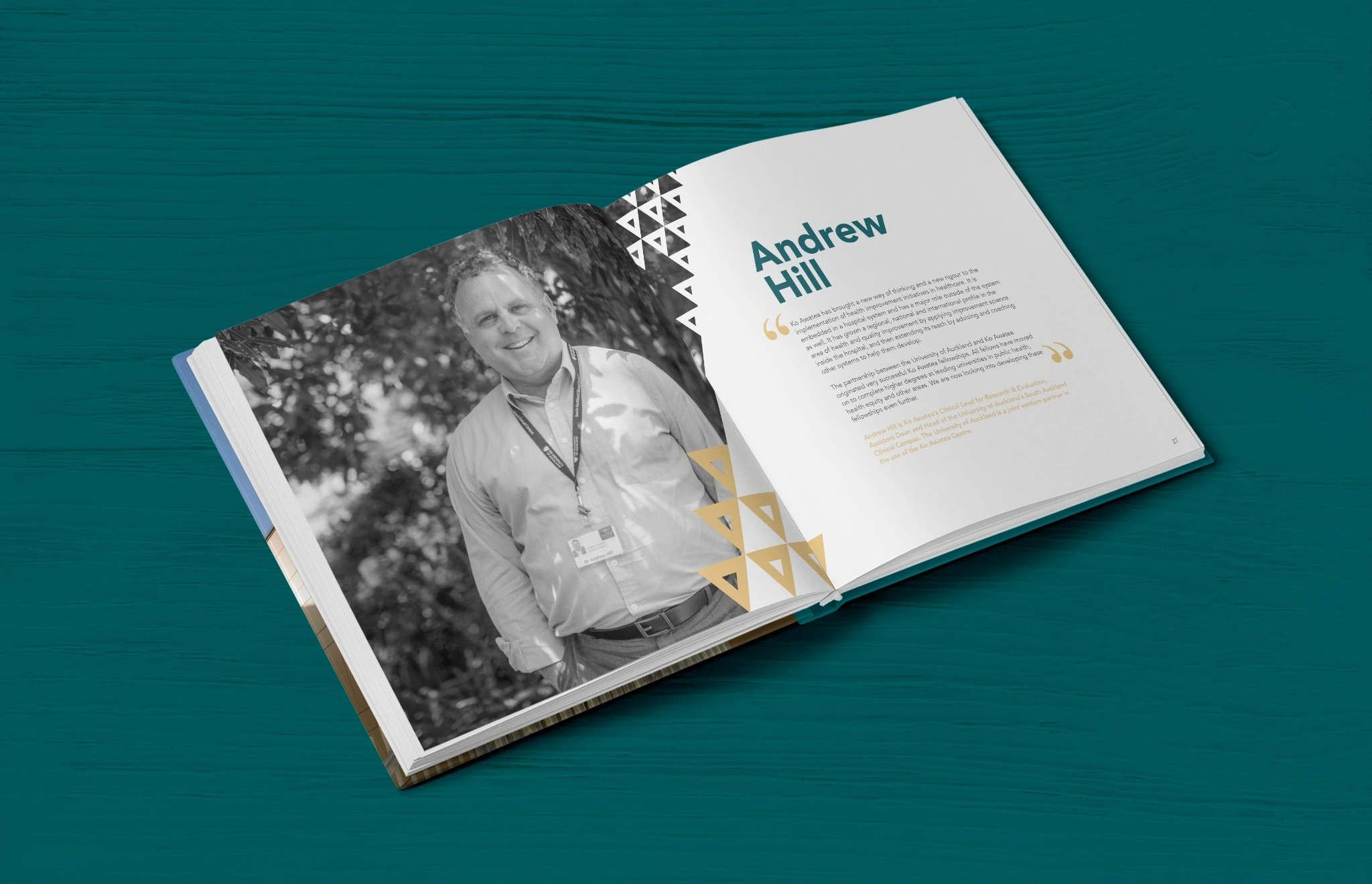
Open Ko Awatea publication showing a portrait and editorial text on a teal surface
Open publication mockup

Structure & storytelling

A story across the pages.

A consistent layout system makes room for both large photographic moments and longer passages of text.
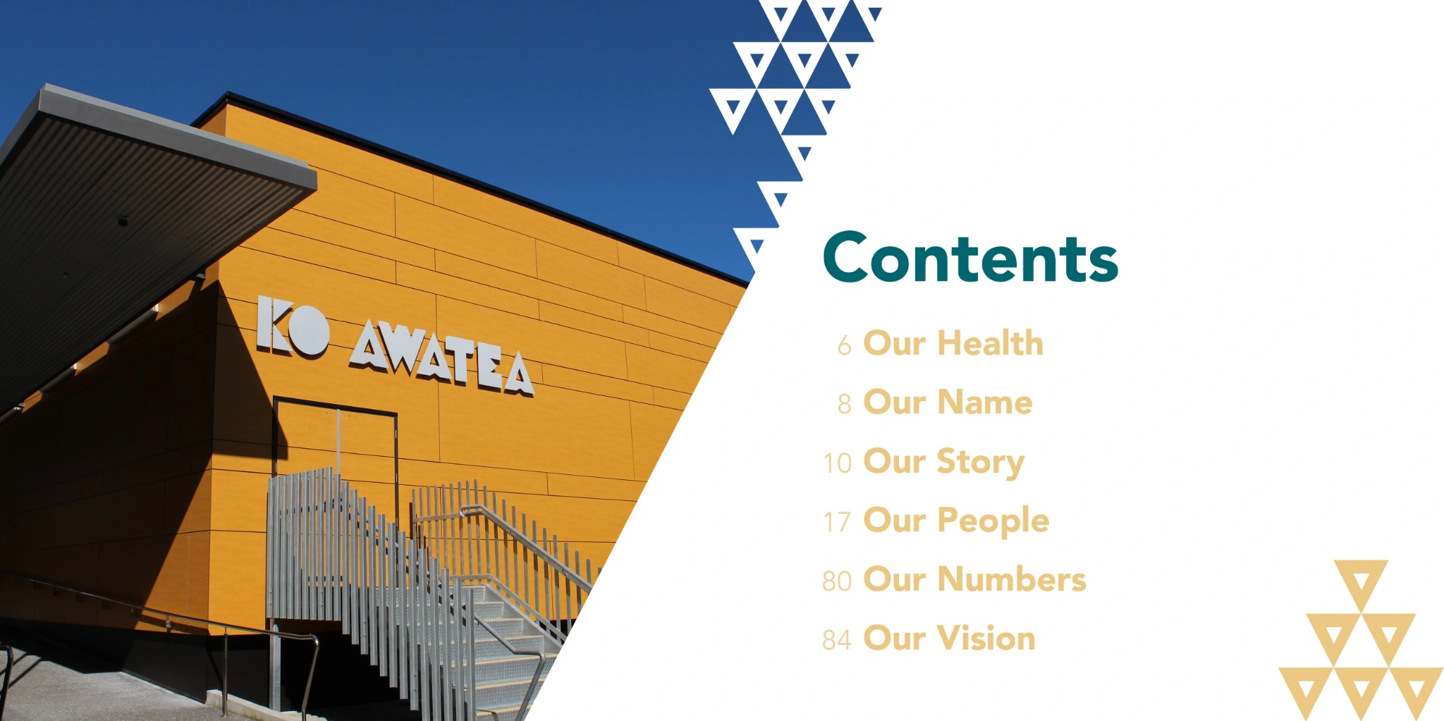
Contents spread with architectural photography, teal and gold typography and triangular motifs
Contents
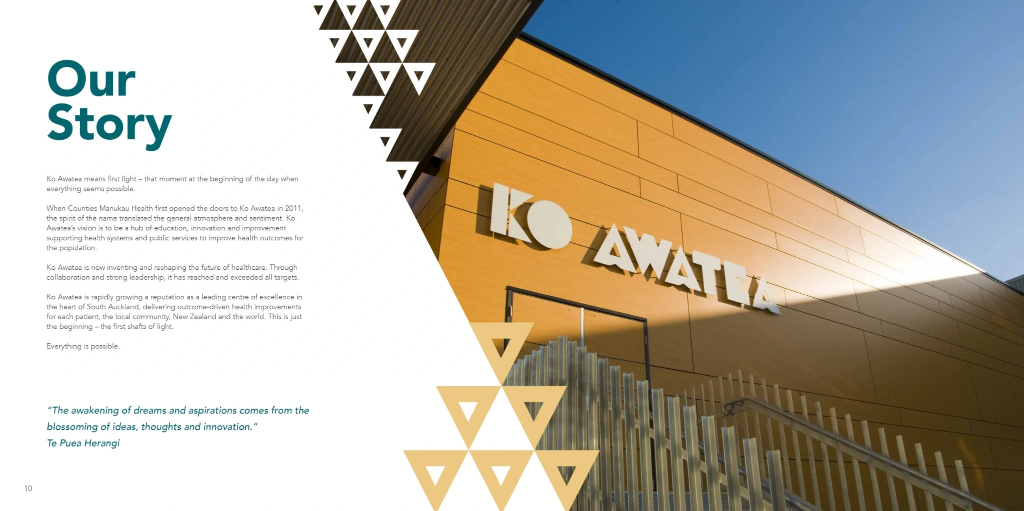
Our Story spread with building photography, geometric framing and a text column
Our Story
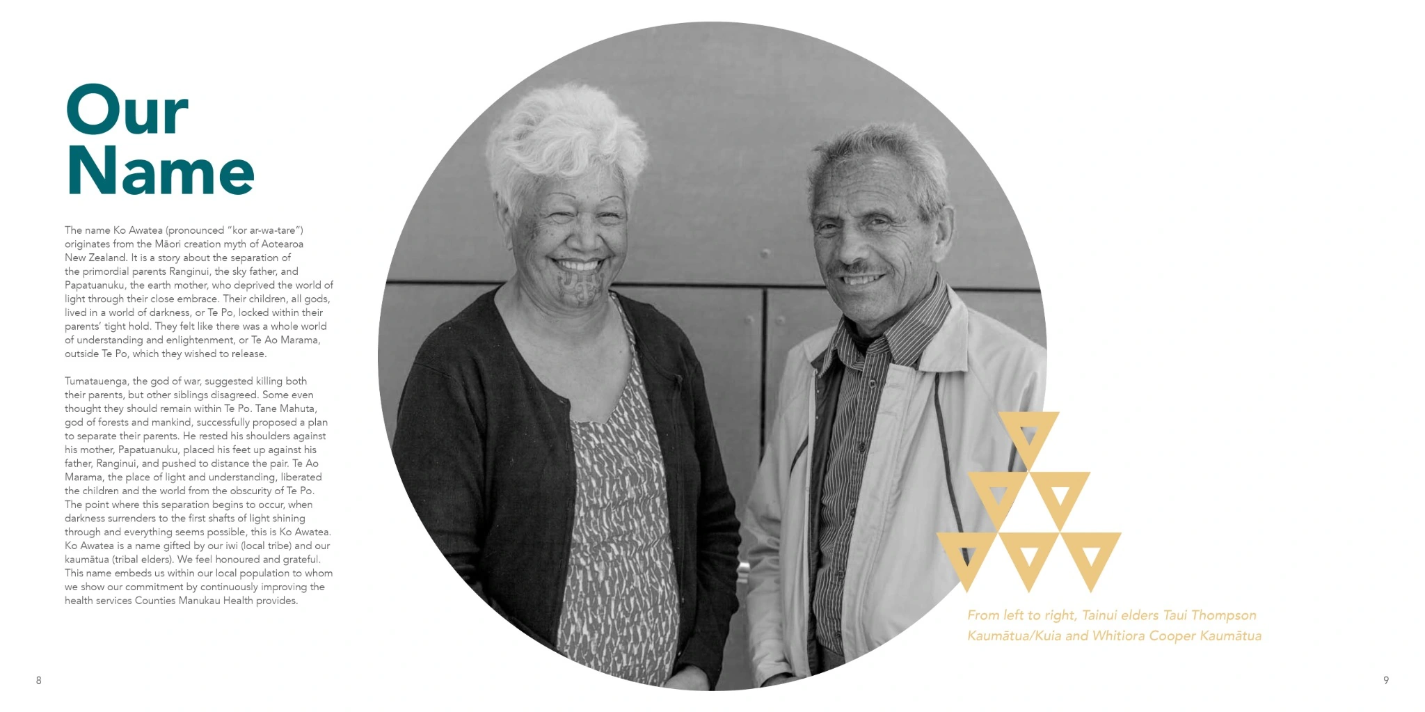
Our Name spread with a large circular black-and-white portrait of two elders and supporting text
Our Name

Portraits & voices

People at the center.

Portrait spreads pair black-and-white photography with generous space, clear hierarchy and quotations. Color and image framing create variation within the same visual system.
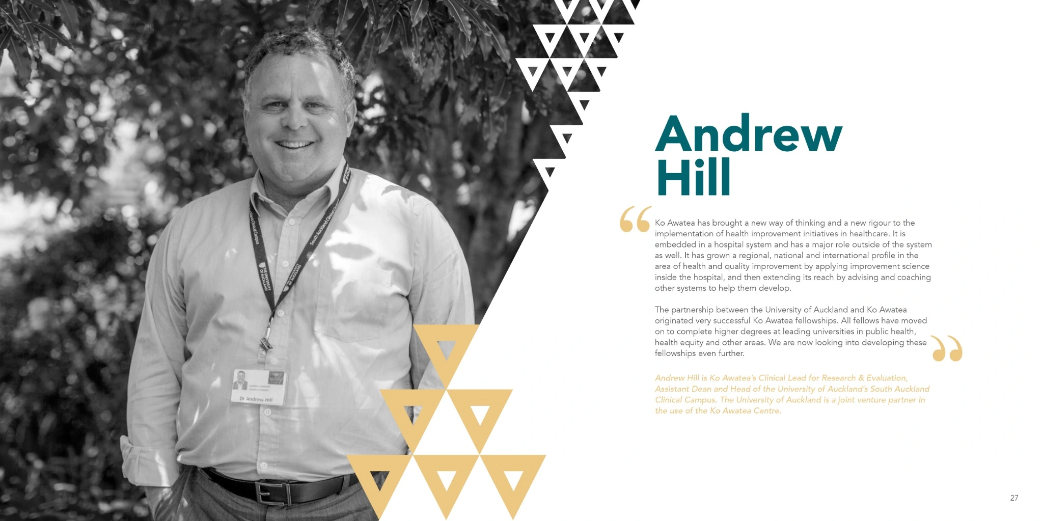
Andrew Hill portrait spread with black-and-white photography and a typographic quotation
Our People · Andrew Hill
View two more portrait spreads
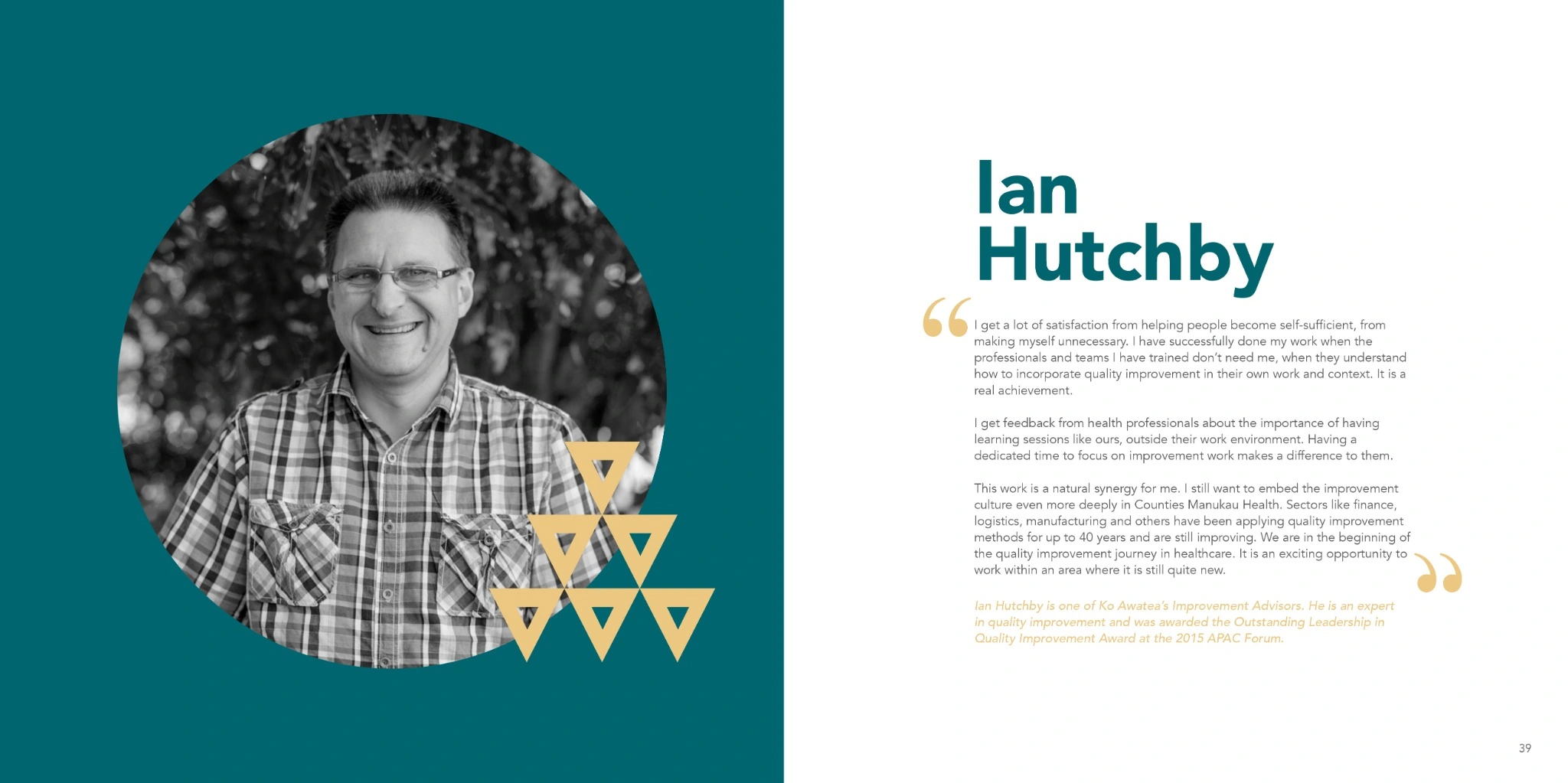
Ian Hutchby portrait spread on teal with circular image framing
Our People · Ian Hutchby
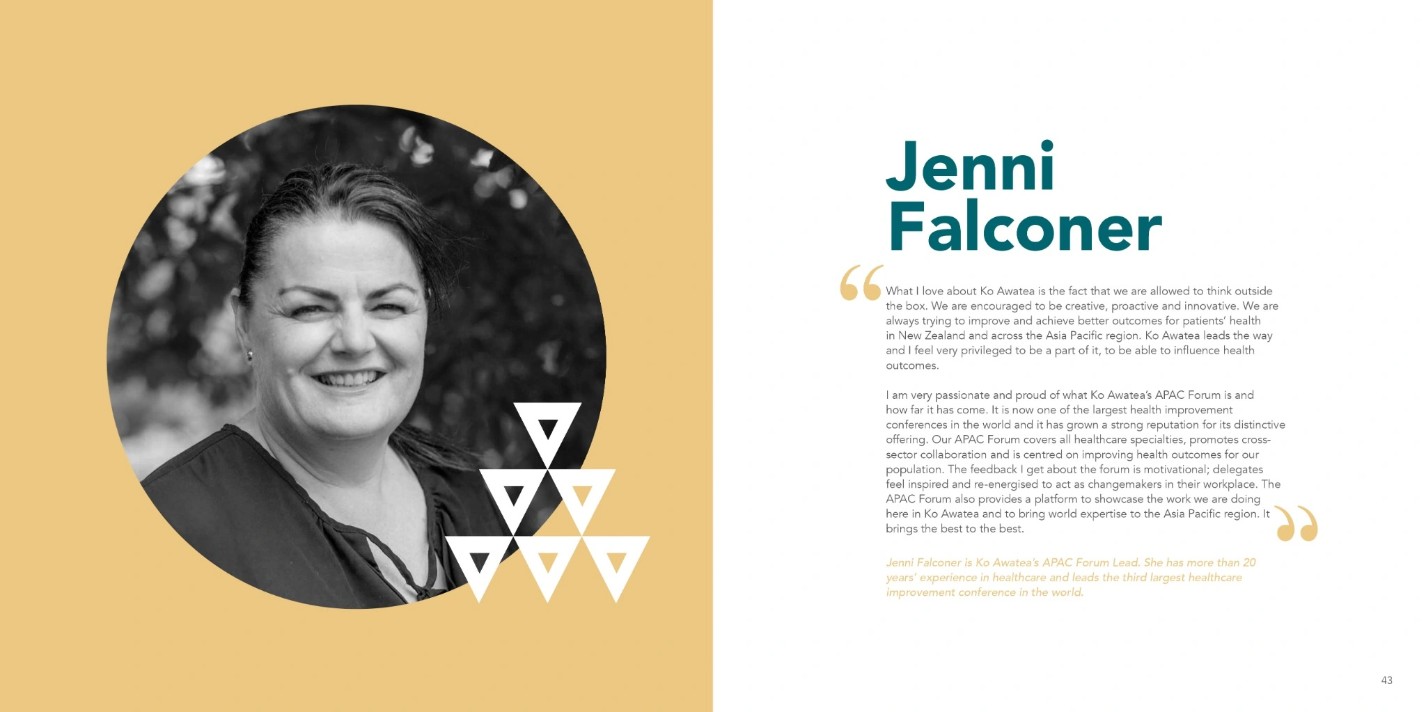
Jenni Falconer portrait spread on gold with teal typography
Our People · Jenni Falconer

Information design

Making the detail clear.

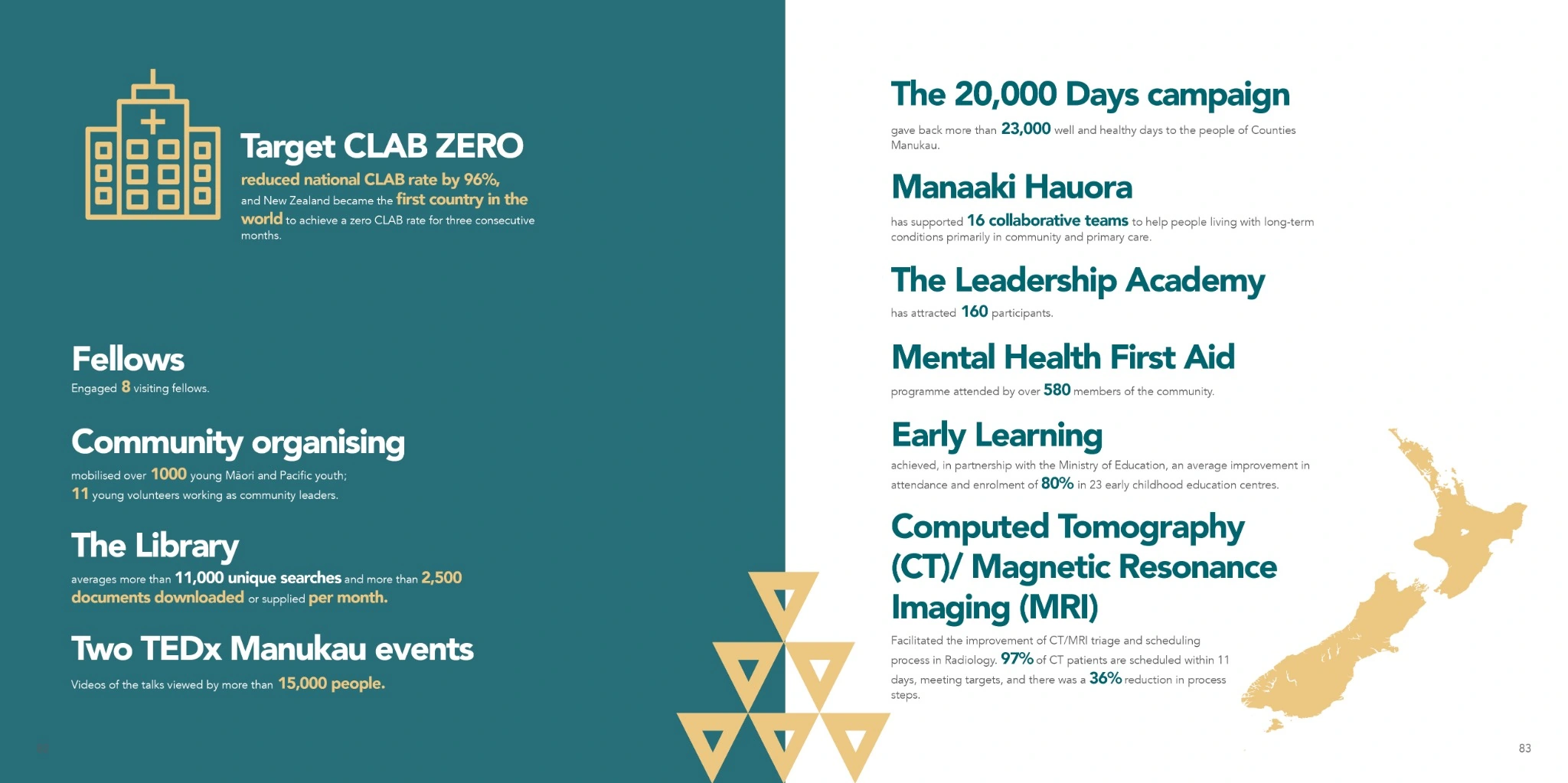
Prominent figures, icons and contrasting panels give readers a clear route through statistics, programs and outcomes.
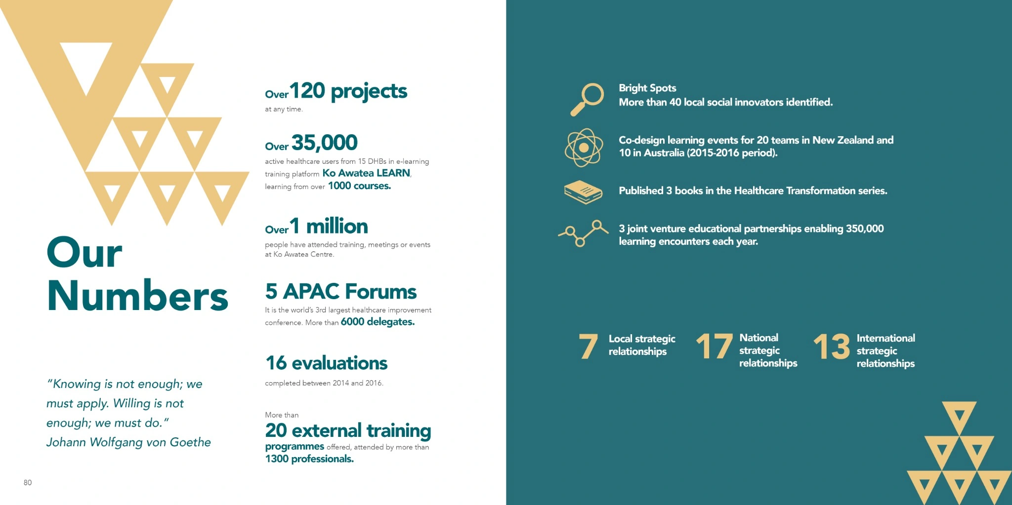
Our Numbers spread with prominent figures, supporting icons and teal and gold panels
Our Numbers
Program outcomes spread organizing information with headings, icons and a map of New Zealand
Programs & outcomes